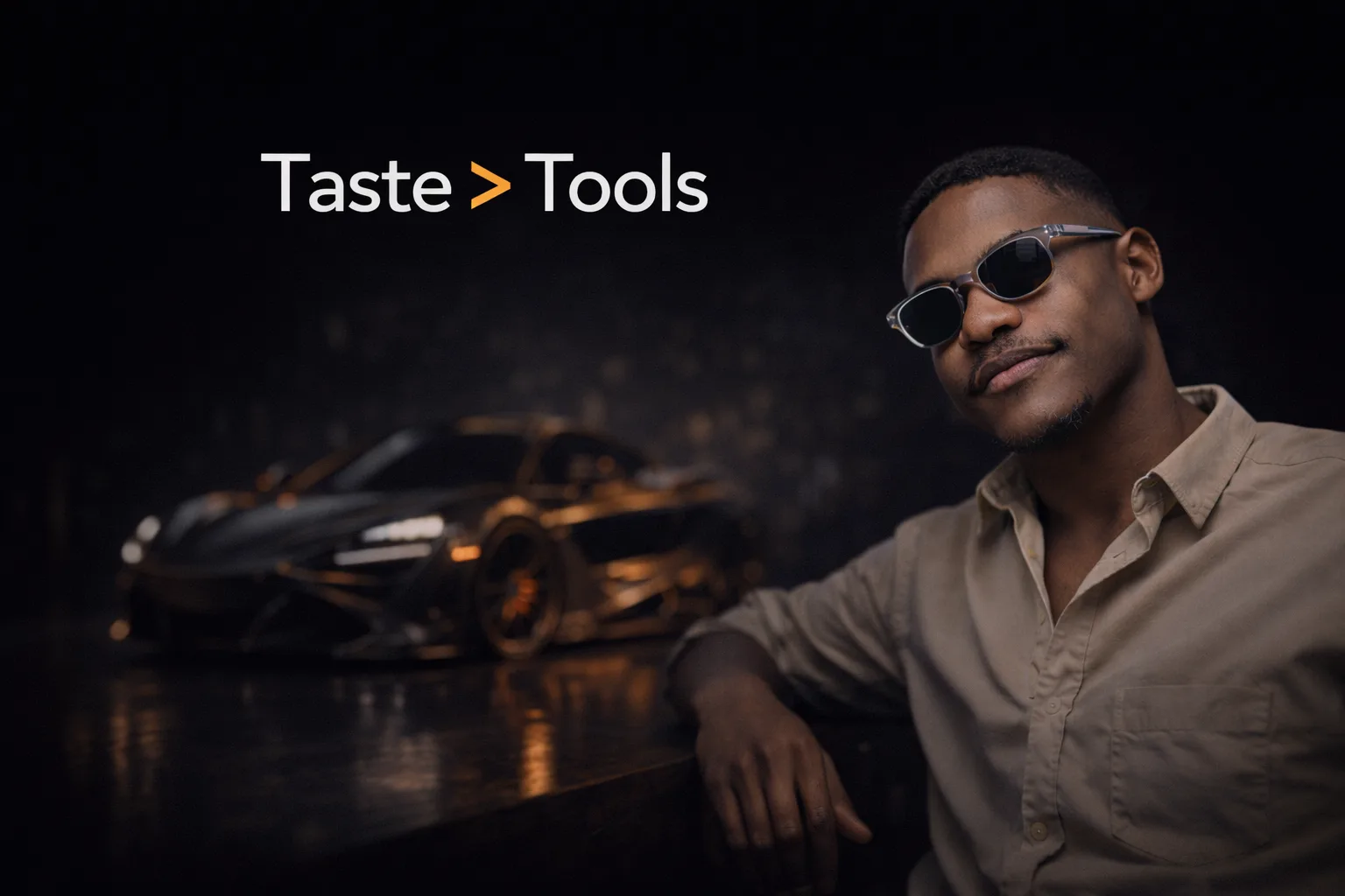
Why Taste Matters More Than Tools in 3D Art
By the Team at Lightson Design Lab
For Craftdas
There is a quiet trap that catches almost every 3D artist at some point. It usually happens about two years in. You've learned the software. You know the hotkeys. You can model, texture, light, and render. And yet, your work still doesn't look like the work you admire. It looks technically correct but visually flat. Competent but not compelling.
The instinctive response is to blame the tools. Maybe if I had a better renderer. Maybe if I used that new plugin. Maybe if I had a faster GPU. So you chase the next thing, and the next, and the next, and the work improves marginally but not fundamentally.
At Lightson Design Lab, we've watched this cycle play out with junior artists, with freelancers we collaborate with, and honestly, with ourselves early in our careers. What we've learned, slowly and sometimes painfully, is that the gap between a decent 3D render and a great one is rarely filled by better software. It's filled by taste.
Taste is a word that makes technical people uncomfortable. It sounds subjective. It sounds like something you're either born with or you're not. But in the context of commercial 3D work, taste is neither mysterious nor innate. It's a set of learnable skills: observation, restraint, visual judgment, and the ability to make decisions that serve a larger creative intent.
Here's why taste matters more than the tool you're holding, and how to cultivate it deliberately.
The Tool Fallacy: Why Better Software Won't Save You
Let's get this out of the way first. The 3D industry runs on a quiet assumption that the next version, the next plugin, the next engine will unlock something that was previously impossible. And to be fair, tools do matter. A dull chisel makes carving wood harder. A slow renderer makes iteration painful.
But we've reached a point in the evolution of 3D software where the tools are no longer the limiting factor. Blender, in the hands of an artist with taste, produces work that is indistinguishable from software that costs thousands of dollars per year. We know this because we do it every day at Lightson. We've delivered product visualizations to luxury brands using a completely free software stack. The clients don't ask what software we used. They ask if we can make it look premium.
The reason better tools don't automatically produce better work is that tools are amplifiers, not creators. A tool amplifies the skill and taste of the person using it. If you have strong taste, a better tool lets you execute that taste more efficiently. If you have weak taste, a better tool just helps you produce mediocre work faster.
We see this most clearly when we look at work produced a decade ago with software that is now considered primitive. There are renders from 2014 made in Blender 2.7 that still hold up beautifully today. Not because the software was advanced—it wasn't—but because the artist understood light, composition, and restraint. Conversely, there is work produced yesterday with the latest and greatest tools that feels empty and forgettable.
The tool is not the artist. The sooner you internalize that, the sooner you can focus on what actually moves the needle.
What Taste Actually Is (And What It Isn't)
Taste, in the context of 3D art, is not about liking certain things. It's not about having a preference for warm lighting over cool lighting, or minimalism over maximalism. Those are stylistic choices, and style is personal.
Taste is the ability to recognize when something is right for the intended purpose and audience. It's the internal compass that says, "That reflection is too sharp. It reads as glass when it should read as polished metal." Or, "That composition is balanced but boring. The eye has nowhere to go." Or, "That detail is technically impressive but visually distracting. It should be removed."
Taste is judgment. It's the accumulation of thousands of micro-decisions made with awareness and intention. It's what separates a render that looks like a 3D model from one that looks like a photograph of a real, desirable object.
The good news is that taste can be developed. It is not a fixed trait. It grows through exposure, analysis, and deliberate practice. Here are the components that make up taste in 3D work, and how to strengthen each one.
Observation: The Foundation of Visual Judgment
You cannot develop taste in a vacuum. Taste is built on a library of visual references stored in your brain, consciously and unconsciously, over years of looking at the world.
The most important habit any 3D artist can cultivate is looking at things with intention. Not scrolling past images on Instagram. Actually looking. Studying. Asking questions.
When you see a product photograph that stops you, don't just admire it. Reverse-engineer it. Where is the key light coming from? How soft are the shadows? What's the focal length? How many lights are there, and what is each one doing? What color is the shadow fill? Is there a rim light separating the subject from the background? What's in focus and what's out of focus?
When you see a material in the real world that feels premium—a leather chair, a brushed metal watch, a matte ceramic mug—look closer. How does the light behave on the surface? Is the reflection sharp or diffuse? Is there a subtle texture? Does the color shift slightly as you move your head?
This kind of active observation builds a mental database. Over time, you develop an intuition for how things should look. You start to notice when a 3D material feels "off" even if you can't immediately articulate why. That's taste at work.
A practical exercise we recommend at Lightson: Keep a visual reference folder. Not a Pinterest board of other people's 3D renders. A folder of real-world photography, film stills, and design objects that embody the quality you aspire to. Study it regularly. Try to recreate the lighting from a single reference image in Blender. Don't copy the subject. Copy the light. This exercise alone will improve your taste faster than any tutorial.
Restraint: The Hardest Skill to Learn
If there is one quality that separates amateur 3D work from professional work more than any other, it's restraint. The ability to stop. The discipline to leave things out.
Beginners tend to add. More lights. More objects in the scene. More details on the model. More contrast in the materials. More saturation in the colors. They want to show you everything they know how to do. The result is visual noise. The eye has nowhere to rest. Nothing feels important because everything is competing for attention.
Professionals tend to subtract. They start with a complex idea and then strip it back to its essence. A single well-placed light. A clean background. A limited color palette. Details only where they serve the story. The result feels intentional, calm, and expensive.
Restraint is hard because it requires confidence. You have to trust that less is enough. You have to resist the urge to add that one more thing just because you can. This is not a technical skill. It's a taste skill. It's knowing when the image is finished, not when you're finished adding to it.
At Lightson, we have a simple rule during the final stages of a project: Before we deliver a render, we ask, "What can we remove?" We look at every element in the frame and ask if it's earning its place. If it's not, it goes. This process almost always improves the image.
Visual Hierarchy: Guiding the Eye With Intention
A render with strong taste has a clear visual hierarchy. The viewer knows exactly where to look first, where to look second, and where to look third. This doesn't happen by accident. It's designed.
Visual hierarchy is created through contrast. The eye is drawn to the brightest areas, the areas of highest detail, the areas of sharpest focus, and the areas of greatest color saturation. A smart artist uses these levers deliberately.
If the hero product is the most important thing in the frame, it should be the brightest thing, or the thing with the most contrast against its background, or the only thing in sharp focus. Everything else should support that hierarchy, not compete with it.
We see many renders where the background is as bright as the subject, or where a secondary prop is more visually interesting than the product, or where the lighting is so even that nothing stands out. These are not technical failures. They are taste failures. They represent a lack of intentional visual hierarchy.
A useful exercise: Look at your render and squint until the image becomes a blur of light and dark shapes. Where is the brightest shape? Where is the darkest shape? Where is the area of highest contrast between light and dark? That's where the eye will go first. If that's not your intended focal point, you need to adjust the hierarchy.
Color and Material Judgment: Beyond the Sliders
The Principled BSDF shader gives you sliders for Metallic, Roughness, Specular, and Clearcoat. It does not give you sliders for "looks like a real object" or "feels premium." Those qualities come from judgment.
A common beginner mistake is to treat materials as binary. Metal is 1. Non-metal is 0. Matte is 0.5 roughness. Glossy is 0.2. The result looks like a video game from 2005.
Real materials are never perfectly uniform. A matte painted surface has microscopic variations that break up the reflection slightly. A polished metal has tiny imperfections that scatter light. Leather has pores and a slight sheen that changes with the angle of view. These subtleties are what make materials read as real.
Developing taste in materials means studying real surfaces and learning to replicate their specific character, not just their basic category. It means knowing that aluminum and steel reflect differently. It means knowing that a rough plastic still has a tiny bit of specular highlight. It means adding subtle variation with noise textures, edge wear, and Fresnel effects.
At Lightson, we spend as much time on material development as we do on modeling. A simple shape with exquisite materials will always look more premium than a complex shape with flat, CG-looking surfaces.
Composition: The Frame as a Design Element
Composition is often treated as an afterthought in 3D. You model the thing, you light the thing, and then you point the camera at the thing. This is backwards.
The frame is the first thing the viewer sees. Before they register the subject, they register the rectangle that contains it. A strong composition makes the subject feel important. A weak composition makes it feel like an afterthought.
Tasteful composition understands negative space. It understands that empty areas are not wasted; they give the subject room to breathe and create a sense of scale and importance. It understands that placing the subject slightly off-center creates dynamic tension. It understands that the edges of the frame are as important as the center.
We encourage artists to compose with intention. Before you render, look at the frame and ask: What is the eye supposed to see first? Is there anything in the frame that doesn't need to be there? Does the background support the subject or distract from it? Would the image be stronger if I cropped in tighter or pulled back wider?
These are not technical questions. They are taste questions. And they make the difference between a render that feels like a screenshot and one that feels like a photograph.
The Long Game: How Taste Develops Over Time
Taste is not built in a weekend. It's the product of years of looking, making, failing, and adjusting. The good news is that it compounds. Every project you complete, every render you study, every material you try to replicate adds to your internal library.
The artists whose work you admire are not necessarily more talented than you. They have simply spent more time looking at good work and making their own work better. They have developed the taste to know what to add and what to remove. They have internalized the principles of light, composition, and material to the point where they no longer have to think about them consciously.
This is the path. It's open to anyone. It doesn't require a faster computer or a more expensive software license. It requires showing up, doing the work, and caring enough to make it better than it was yesterday.
At Lightson Design Lab, we remind ourselves of this constantly. The tools will change. The software will update. The render engines will get faster. But the fundamentals—light, composition, material, restraint, hierarchy—are timeless. They are the difference between work that is technically competent and work that is genuinely compelling.
Invest in your taste. Look at more things. Study more references. Be more critical of your own work. Remove more than you add. Over time, you'll find that the tools matter less and less, and the quality of your eye matters more and more.
That's not a limitation. That's freedom. It means the thing that makes great work possible is already inside you, waiting to be developed.
Now go look at something beautiful, and figure out why it works.